Primary CTA
BUTTON
BUTTON
BUTTON
BUTTON
By proceeding, you agree to the Terms & Conditions
BUTTON
BUTTON
By proceeding, you agree to the Terms & Conditions
Scaling
cross-platform Design System
Component Libraries
Scalable Design
UI KIts
A streamlined design system covering 600+ variant components that embody the brand’s bold identity. Deployed across 5 subsidiaries ensuring consistent visual language for 20+ products and services.
My Roles
UI Libraries, Interaction Design, Governance, Deployment, Workshops, Design Documentation.
Time
2021, 6 Months
Goals
Unify the company wide design practices and elements across to enhance consistency, improve user experience, and accelerate the development process that supports scalability and adaptability across various platforms.
Solution
Develop reusable UI components, well-documented design guidelines, and clear usage specifications; integrated with a collaborative tool that facilitates easy refinement, real-time updates and feedback loops between designers from different teams as well as developers and other stakeholders.

Highlights
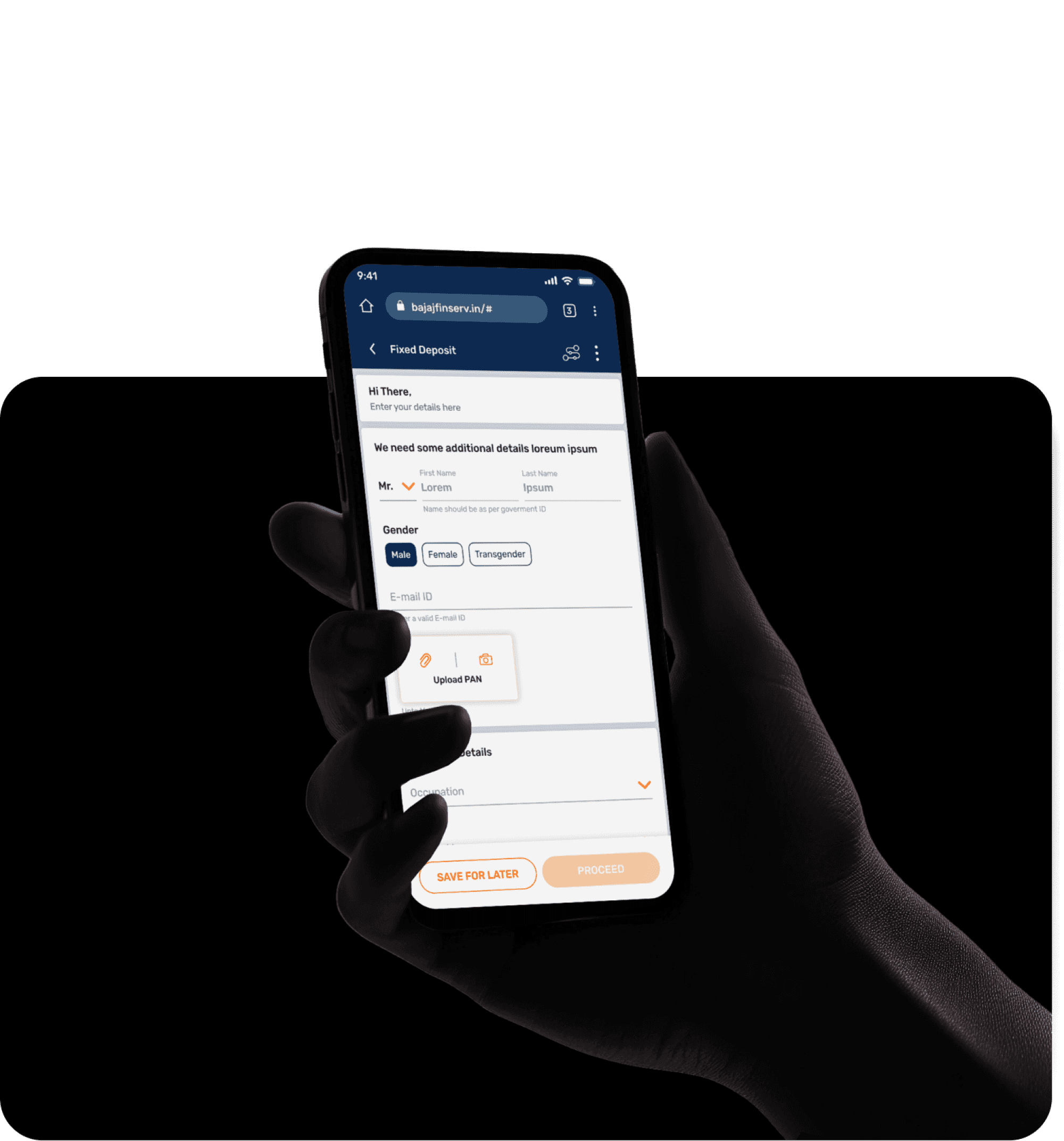
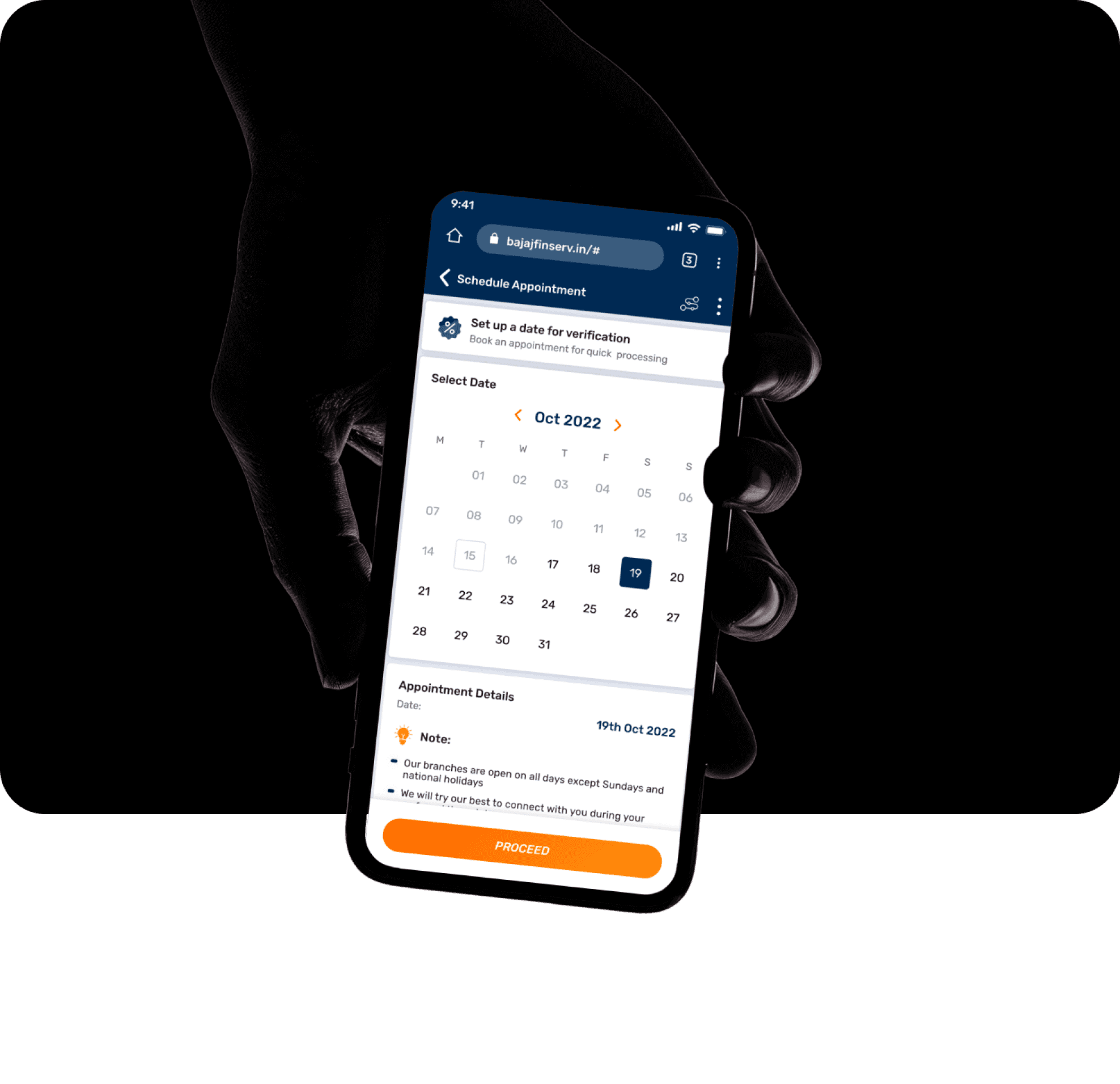
With a dedicated studio team of 6, I led the creation and governance of the design system making it a cohesive skeleton that serves 35.5M+ users on the super-app and additional customers across digital ecosystem of five subsidiaries. This centralized framework, connecting 40+ designers located nation wide, encompasses an extraordinary breadth of components from finance, housing, health to e-commerce divisions.
72+
Global Components
40+
Remotely connected Design users
35.5M+
Super-app Users
Who Uses These?
Finance
Housing
UPI and Payments
Health
Ecommerce
Partners
Merchants
To support the company's dynamic design teams that work on multiple projects simultaneously, the design system is created to be versatile and adaptable across various platforms. From fundamental atoms to page-level components, the UI elements seamlessly integrate across diverse digital environments, ensuring scalability and consistency in every application.
SaaS Platfroms
B2B Portals
E-commerce Markets
Corporate Portals
Native Apps
Mobile-first Websites
Form Journeys
Third Party Integrations
Cut to the chase
Unveiling the Soul
With a 16-year journey, the company has served customers through offline and agent-based models. It boasts a customer base of 57.6M+ and a close-knit network of 133K+ stores.
When establishing a new digital identity in late 2019, the design team embraced a startup-within-a-corporate ethos, meticulously crafting designs that later led to the Design System project in 2021. Prior to it’s deployment, we underwent various rounds of testing both internally and with portions of live users, evaluating nuanced details and comparing UI elements.
Crisp
Journeys that minimize steps and maximize task speed
Bold
Confident and youthful identity with vibrant visual language
Secure
Instills long-term trust regarding users’ data and privacy
Scalable
Fluid and smooth adaptation across a wide array of platforms
competent
Embodies the expertise of the leading NBFC in India
The target audience spans from young adults of 22 years to senior citizens aged 65 years and above, with the majority falling within the age range of 42 to 54 years.
Breaking the mold
Designers
Executives
Previous process | Business Driven Projects
The Gap
Dev library
Broken down
UI elements
Designs
UI and Prototypes
Design process
Handover
Developers
Live Product

The Gap
The deployment of the design system encountered several hurdles in achieving cross-functional adoption. Previously, developers created live sites directly, relying on their CSS and CMS libraries. Design files and prototypes were fluid references rather than concrete blueprints, leading to significant disparities between the envisioned and live products.
Primary Button
Floating
Center
Solid Fill
Sentence Case
Span
Inline
Primary Button
Primary Button
Primary Button
Primary Button
Primary Button
Transactions
Updated 2 minutes ago
4px
Transactions
Updated 2 minutes ago
8px
Bridged this gap between designers and developers, we integrated elements from dev libraries and live products into the new design system. This not only enhanced cross-functional collaboration, but also streamlined the processes minimizing inconsistencies.
Weaving the Threads
Previously, UI elements varied across platforms, leading to inconsistency. For instance, a transaction display table on a SaaS platform differed from a history table on the Super-App due to backend disparities.
Multiple design teams operated independently without an organizational hierarchy, each defining their own separate design systems.
Partners Project
Previous dynamics | Plum-pudding model
Merchants Project
Wallets Team
Designer B1
Designer B3
Designer B2
Project WIP
Wallets DSM
Housing Team
Designer A1
Designer A2
Project Live
No DSM
SuperApp Project
Live Testing
Design System 1

Payments Team
To address this, we formed a core design team, where I played a key role, ensuring alignment of design standards across projects. We adopted a unified "One for all" approach, establishing a centralized system with clear guidelines for fundamental elements.
This succeeded with the development of platform-specific guidelines and interactive variants, aided with continuous updates and refinements through collaboration with peripheral design teams.
New dynamics | Nuclear Atomic Model
Designer 2
Designer 1
Designer 3
The Design System
Core Design Team
Quality Check
Quality Check
Library
Library
Designer B1
Designer B2
Designer C1
Designer A1
Designer A2
Designer D1
Designer D2
Designer D3
After establishing the libraries, we fostered autonomy in collaboration through workshops and weekly design sessions. The design system not only decreased dependency but also instilled shared ownership among peripheral design teams, fostering a vibrant design community and enhancing creative communication.
The Main Dish
Condensed into 6 comprehensive kits, the design system boasts a swift exponential learning curve. With context-based hierarchy, designers can effortlessly determine the appropriate usage of each element.
Style Kit

Style Kit
51 Colors
20 BGs
19 Text styles


Icon Kit

Icon Kit
400+ Icons
5 Icon Styles
Motions
Label
|
Subtext

Motions
17 unique Interactions
Graphic Kit

Graphic Kit
74 Curated Illustrations

Mobile Kit
All
Insurance
Loans
Cards
Investment


Card heading
Value
Lorem ipsum dolor sit amet, consectetur adipiscing elit. Et auctor feugiat dignissim ipsum urna metus, mauris.
Heading
Product Type
₹5,300
January
₹320
February
₹320
March
₹320
January
₹320
January
₹320


Mobile Kit
394 Components
Desktop Kit


Recommended Videos
00:46
How is the amount for pre-approved personal loans decided?
256
00:46
Factors affecting your eligibility for personal loans
256
Last watched: 23rd Mar 2022
Upto
10% cashback

On Home Appliances, Furniture, TVs and more select categories.
Applicable on all payment methods.
Valid: 31 Nov’21
REDEEM
75
Cashback Earned
2000
BFL Points

7
In Progress

15
Vouchers
Nominee and joint account holder cannot be the same
Add a Joint Account Holder
A joint account holder has to be above 18 years
NOW
LATER
Mr.
First Name
Lorem
Name should be as per PAN card
Last Name
Ipsum
Deposit Payable to
Either or Survivor
Number One or Survivor/s
Anyone or Survivor/s
Tracker
Basic Details
Offer Details
KYC Details
Bank Details
Loan Summary
E-Aggrement
Disbursement
Desktop Kit
231 Components
Inspired by Brad Frost's atomic design ideology, our design system builds from thousands of atoms into 600 molecules, which then form organisms and culminate in 6 unique, commonly used page layouts.
Atoms
Colours
Gradients
Spacing
Typography
Icons
Buttons
Checkboxes
Radio Buttons
Inputs
Tags
Labels
Tabs
Breadcrumbs
Illustrations
Backgrounds
...
Molecules
Card Heading
Search Bar
Header Bar
Hamburger Menu
Dropdowns
Popups & Overlays
Notification Panel
Journey Tracker
Store Locator
Calendar Variants
Bottom Nav
...
Organisms
FAQs Card
Financial Calculator
Form Application
Support Chat Bot
Product Description Card
Rewards
Video Carousal
General Cards
Onboarding Graphics
Coach Marks
Advertisements
...
Page Layouts
Homepage
Forms Layout
Product Listing Page
FAQ & Help
Category Listing Page
Grids
...
Style Kit
Icon Kit
Graphic Kit
Global Responsive - Mobile & Desktop Kits
Contextual - Mobile & Desktop Kits
Cherry on the top
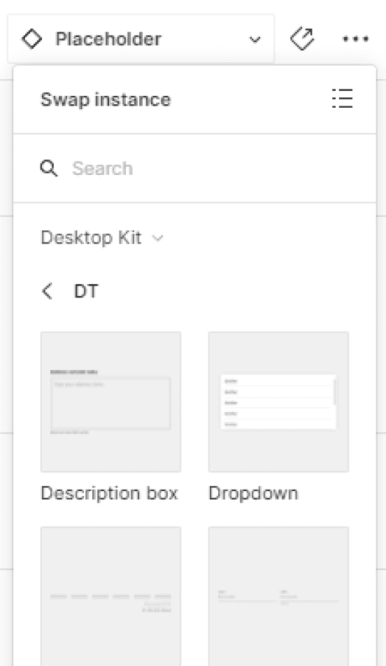
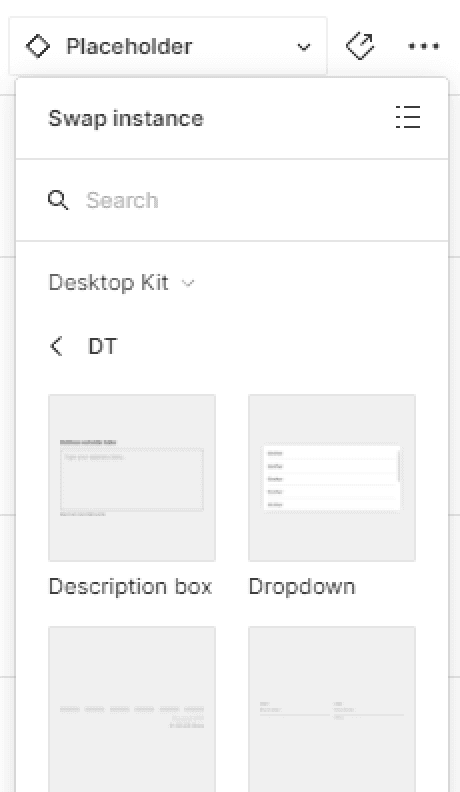
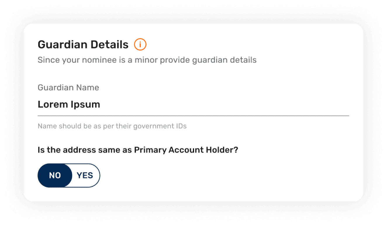
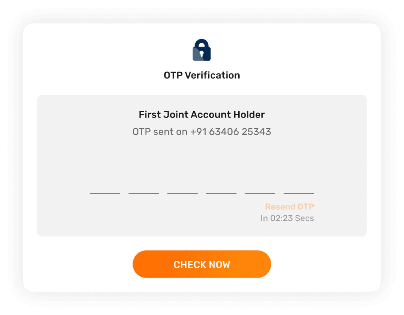
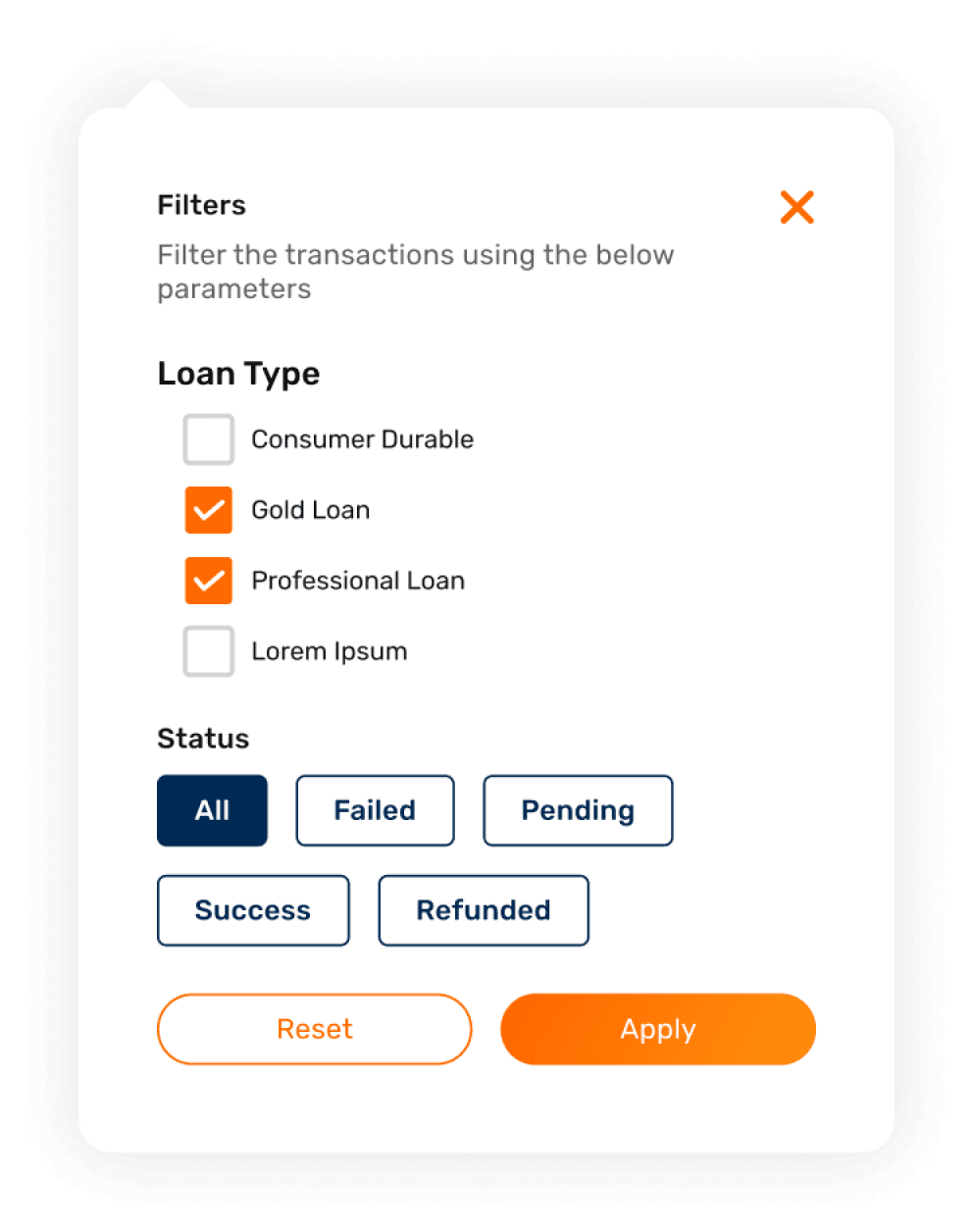
The placeholder element in builder cards can be seamlessly swapped with various molecular components, making it an invaluable tool for any new designer onboarding into the company's design ecosystem.
Offering unmatched flexibility across diverse use cases—from filters and information cards to application forms—it guarantees consistency and precise spacing, all while minimizing cognitive load.
The Builder Component
Heading
Placeholder Component
Replace with desired element
Placeholder Component
Replace with desired element
Placeholder Component
Replace with desired element
Placeholder Component
Replace with desired element
Unhide for More
Replace with desired element


Figma UI
Pieces of the Puzzle
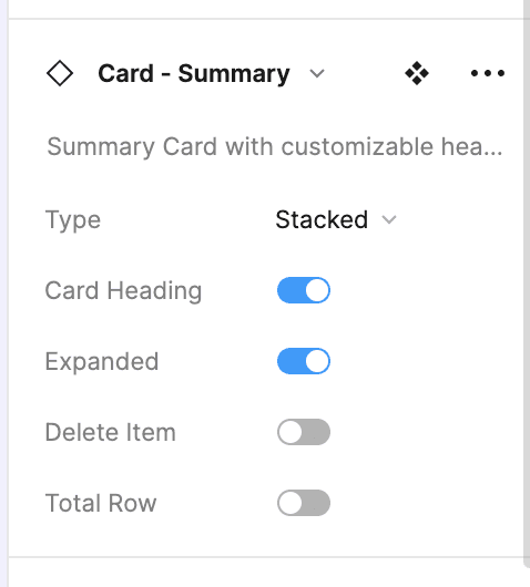
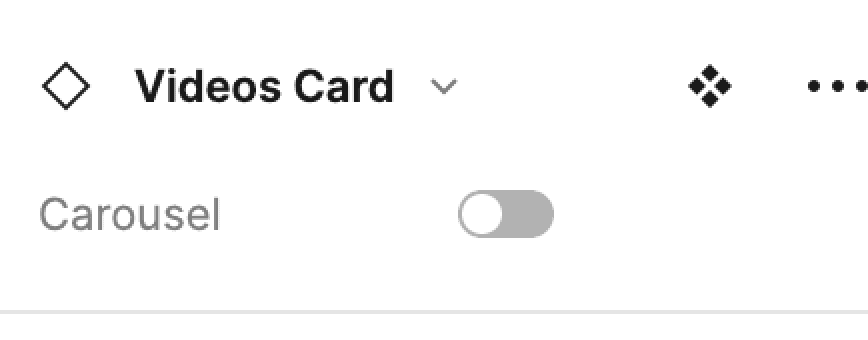
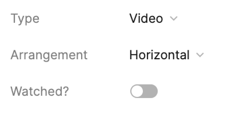
Leveraging 600+ interactive variants, it harmonizes flexibility and consistency, with intuitive toggles to enable rapid hi-fidelity prototyping and nurture an agile culture.
Default
Disabled
Icon
Icon+Disabled
Small
Large
Primary
Secondary
Primary
Secondary
Check now
Check now
Check now
Check now
Check now
Check now
Check now
Check now
Check now
Check now
Check now
Check now
Check now
Check now
Check now
Check now
Check now
Check now
Check now
Check now
Check now
Check now
Check now
Check now
Default
1 Icon
2 Icons
Empty
Filled
Success
Error
Uneditable
Label
Subtext
Label
Placeholder
Subtext
Label
Placeholder
Subtext
Label
Placeholder
Subtext
Label
Placeholder
Subtext
Label
Subtext
Label
Placeholder
Subtext
Label
Placeholder
Subtext
Label
Placeholder
Subtext
Label
Placeholder
Subtext
Label
Subtext
Label
Placeholder
Subtext
Label
Placeholder
Subtext
Label
Placeholder
Subtext
Label
Placeholder
Subtext
Thank you!
Let’s Chat
The best place to shoot me a ‘hey’ is

